Step1: Import Libraries like numpy, pandas, matplotlib.pyplot. Step2: Download the data from local or from web. Step3: Using head()- First 5 records of the data downloaded.Step4: Using tail()- Last 5 records of the data downloaded. Step5: Using Shape- View the shape of the data (Rows, columns).Step6: Using plt.plot()- plot the data points
- Install Libraries
Install libraries like pandas, numpy, sk.learn, statsmodels.api, matplot.lib, seaborn
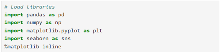
- Load libraries
3. Read Data: You can read data from csv, excel or database using required functions. Here I have used ‘SalaryData.csv’.

4. Convert data into dataframe:
5.Read data using head and tail functions
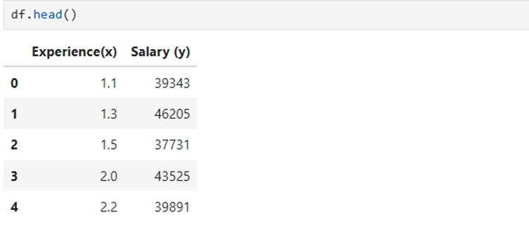
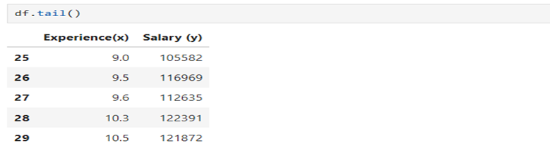
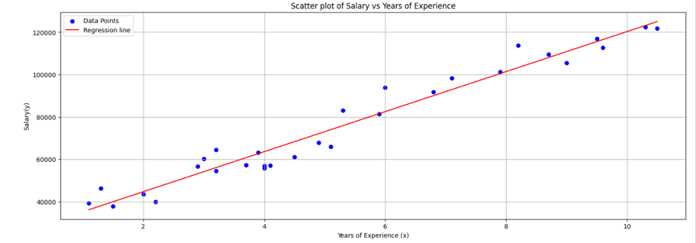
6. Containing only two variables 1) Experience and 2) Salary. Let us take Salary as dependent variable/target variable and Experience in years as Independent/Explanatory variable
7.Find the shape of the data: Data contains 30 observations and two columns

8.Find the type of data features/columns

Both features are numerical one is float64 and other is int64
9. View the descriptive statistics of the data being examined
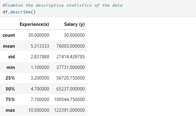
Here we find count of the observations made, mean, std, min, First Quartile, Second Quartile, Third quartile and max of two features.
10.Calculate the number of NaN (Non available Number) /null figure in features
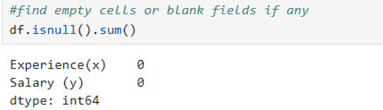
Here all 30 rows and two columns are available. There is no empty cells
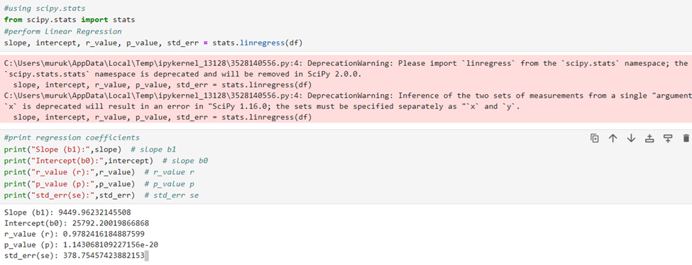
You can straight-a-way find the value of parameters like slope, intercept, r_value, p_value, and SSE using stats.linregress function. Arguments are data
Visualization using matplotlib.pyplot library:
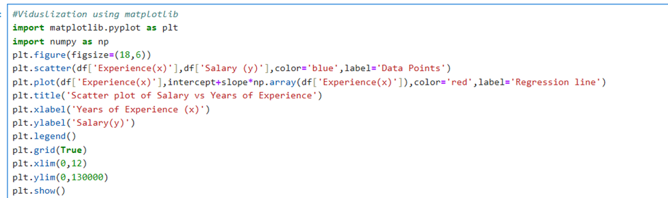
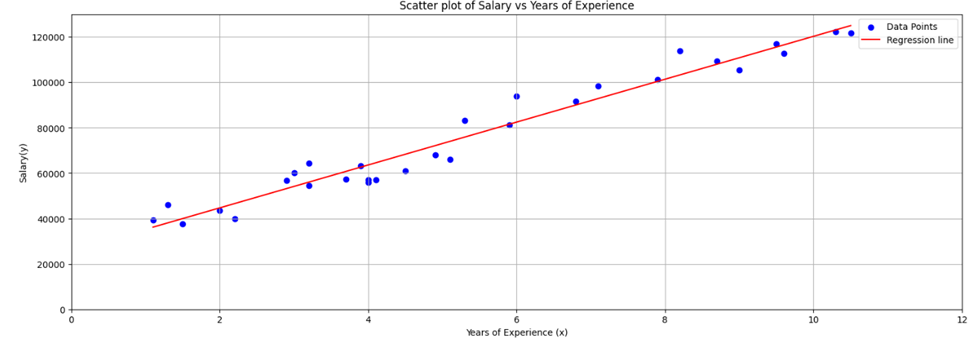
If you remove plt.xlim() and plt.ylim you will get the following scatter diagram